
Paint Color Selection Tips for Homes in Cook County
Choosing the right paint color can completely change how a space feels. Whether you’re working with a small room in an older Cook County home or planning a modern refresh for open-concept living, your color decisions set the mood. Paint, not furniture, flooring, or décor, covers the most space in any room and plays a big role in how inviting and balanced it feels. That choice isn’t just about personal taste. It’s about how color interacts with light, layout, function, and even the weather outside.
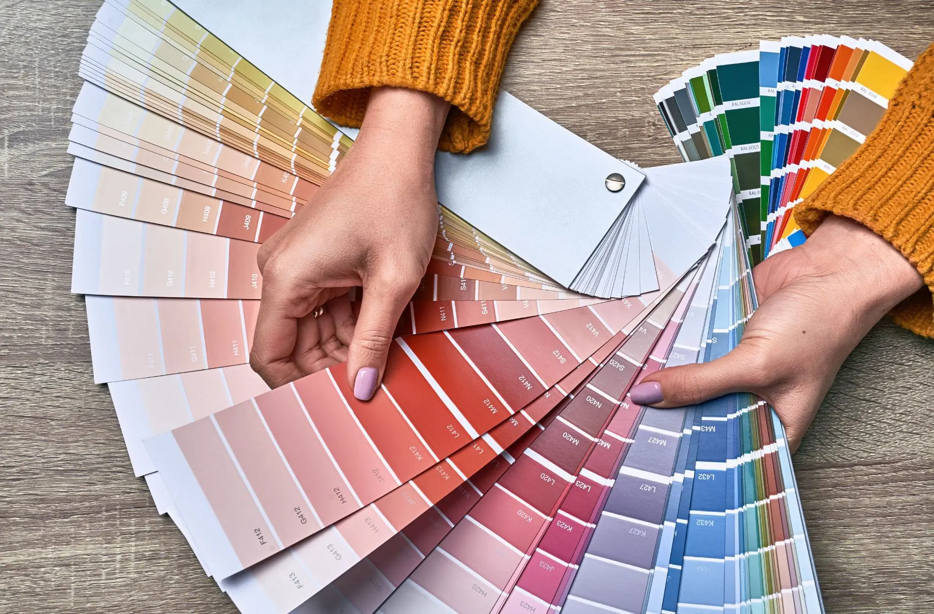
Summer in Cook County is a popular time for home improvement. Homeowners often look at their walls and see opportunities for a brighter, more updated feel. Picking a color sounds simple, but standing in front of a wall of swatches at the paint store quickly turns overwhelming. Knowing how different colors influence our mindset helps narrow things down fast. It’s not just about grabbing the most popular shade. It’s about creating a space where people actually feel at home.
Understanding Color Psychology
Color affects how we feel in ways we often don’t even notice. That’s why certain shades work better in specific rooms. Lighter blues and greens, for example, are calming and usually great choices for bedrooms, where relaxation is the goal. Kitchens, on the other hand, often work well with warmer tones like soft yellows or muted rusts. These colors bring a bit of energy and warmth without overwhelming the space.
Neutral tones like beiges, greys, and creams continue to be popular for open living areas because they allow flexibility with décor. But using only neutrals can sometimes leave a room feeling flat. Adding one or two accent colors in smaller ways, like on a single wall, a piece of furniture, or trim, can make the space feel more layered and interesting without going overboard.
Here are a few quick recommendations based on room type:
- Living room: Warm neutrals like taupe, soft greys, or earthy tones. Easy to pair with all kinds of furniture.
- Bedroom: Cool colors like soft blue, sage green, or lavender invite rest and sleep.
- Kitchen: Cream, terracotta, or pale yellow give warmth and make gathering spaces feel inviting.
- Bathroom: Clean whites or light greys with one subtle color can make small rooms feel larger.
For homes in Cook County, where days can feel brighter in the summer but dimmer during long winters, it’s worth picking shades that can hold up in both types of light. A cheerful light green or even a creamy peach can feel equally cozy in the cold season and airy when the sun’s out.
Considering Natural Light
Natural light makes a big difference in how your paint color appears once it’s on your walls. A color that looks like a soft white on a swatch could lean toward yellow in a sun-drenched room. The direction your windows face and how much daylight each room gets should be front of mind. This is often overlooked but can make or break the final result.
If you’re working with a north-facing room, natural light tends to be cooler and softer. Paints with warmer undertones, like warm grey, beige, or blush, help balance things out. South-facing rooms get more light for longer periods, so they can handle both light and dark colors well. You can even go bolder in these rooms without the space feeling too closed in. East-facing spaces get softer light in the morning, while west-facing rooms can have golden light flooding in late in the day. Understanding that daily shift helps when deciding how warm or cool your color should be.
To work with light the right way, try this:
- Paint swatches on more than one wall to see how natural light affects them at different times of day
- Compare how the color looks first thing in the morning, midafternoon, and when the sun begins to set
- Avoid bright whites in brightly lit rooms as they can appear harsh. Instead, pick a warmer soft white or gentle beige
- Stick to medium tones in darker rooms unless you want a more dramatic, cozy feel
Whether you’re refreshing a kitchen in Oak Park or redoing a bedroom in Evanston, paying attention to how the sun hits the walls is a smart step in choosing paint that works for all seasons.
Coordinating With Existing Decor
Wall color doesn’t live in a vacuum. Before choosing a shade, it helps to think about what already exists in the space—furniture, floors, rugs, and other décor. An off-white wall might look clean and crisp with dark wood furniture, but that same white could fall completely flat if paired with pale beige fabric and light wood floors. Balance plays a big role in how colors feel once they’re on the wall.
If your furniture includes bold colors or patterns, it might make sense to scale back on wall color and let those items stand out. On the flip side, if your furnishings are mostly neutral or minimalist, painting the walls something bolder—even just one wall—can bring life into the room. Accent walls are great for this and work best when they have a purpose, like highlighting an architectural feature or creating a visual anchor.
To avoid clashing or tension in the room, try these tips:
- Find a color that already exists in your space, like a throw pillow or artwork, and use a lighter or darker version of it for the walls
- Stick with undertone families. Cool tones like grey, blue, or mint tend to work well together, while mixing warm and cool can feel off
- Don’t just rely on digital previews. Test real paint swatches next to your furniture and décor under different lighting
- Repeat a color at least twice in the room such as wall to cushion or rug to curtains to make the palette feel consistent
A soft dusty blue might pair nicely with silver fixtures and white trim. A rich tan can feel grounded with deep brown or mustard accents. If your goal is to refresh without replacing everything, the right wall color can do a lot of the heavy lifting.
Trending Paint Colors For Cook County Homes In 2025
Every year, new colors show up in magazines and on shelves. What’s trending in 2025 leans toward richer, earthier tones mixed with calming neutrals. Think clay reds, olive greens, powdery blues, and soft oatmeals. These shades work well in Cook County homes because they suit both long winters and bright summers, adapting nicely to the changing daylight.
You don’t have to commit your entire home to a trend to enjoy it. Try using trending shades in small ways—like a guest room wall, hallway trim, or even a bold interior door. This makes it easy to keep your space feeling updated without losing your personal touch.
Here are some top 2025 color picks and where they shine:
- Deep dried-clay or terracotta tones: Great for accent walls in living rooms with warm wood furnishings
- Dusty olive or eucalyptus green: Creates a calming feel in kitchens or workspaces
- Powder blue or soft lavender-grey: Ideal for bedrooms or bathrooms that need to feel more open
- Warm oatmeal or putty beige: A go-to for larger spaces like open floor plans as it keeps things neutral but not boring
You don’t have to go all-in. Even updating bookcase backs or painting just a section of the trim in one of these trending colors can make a subtle but interesting shift.
Turning Color Choices Into a Beautiful Home
Choosing paint colors often feels like a big commitment. But once you’ve thought about the room’s purpose, its lighting, what’s already in it, and the feeling you want the space to give off, your options get clearer.
The most important goal is how the space feels when it’s done. Maybe you want to make a small room feel open with cool tones, or turn a hallway into something eye-catching with a charcoal feature wall. You don’t have to chase bold trends or go with someone else’s favorite. The right choice is what feels right to you.
And once that decision is made, the next big thing is execution. A smooth, clean finish can make even the simplest color feel fresh and custom. Making sure your paint job turns out crisp and clean makes all the difference in how the space actually turns out. When done right, color has the power to make your entire home feel brand new.
To truly transform your home and bring your vision to life, trust Damian’s Painting to deliver top-tier results. For us, it’s all about enhancing your living spaces to reflect your unique style. Learn how we can help with interior painting in Cook County and create a space that feels just right for you.